
A compound bar graph is a graphic that combines two or more types of data into one. It can also make comparisons between various numbers. A compound bar graph is a form of bar chart in which columns are divided into parts to indicate data breakdown. The different variables being compared are then shaded or colored differently on these bars.
The data is displayed in a horizontal fashion on a horizontal bar graph. It’s a graph with horizontally painted bars. The data categories are displayed on the vertical axis, while the data values are displayed on the horizontal axis. Each bar is the same length as the value associated with the data category, and all bars run from left to right.
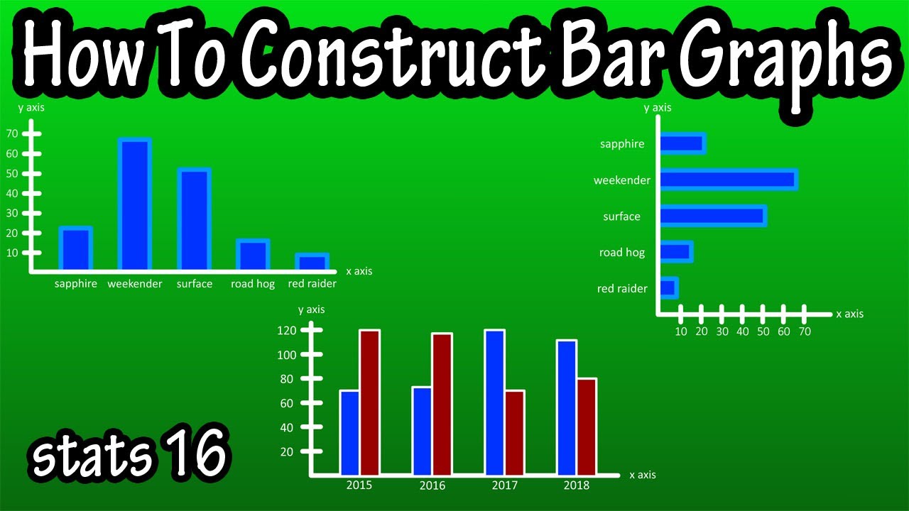
How to Create Combined Bar Graphs
Data is organized into a physical representation called a bar graph, which makes it easier to interpret. However, after you’ve made a few graphs, the information becomes difficult to compare. Combining numerous bar graphs into a single graph allows you to stack information side by side and readily analyze the data in relation to the other data.
- Open the document containing the data you want to combine into a single bar graph. If any graphs or charts have been made up to this point, delete them by right-clicking and selecting “Delete.”
- Only the data for the first graph should be highlighted. If you wish to merge the “Expenses” and “Profit” graphs, for example, only highlight one of those pieces of data.
- Select “Bar” from the “Charts” group under “Insert.” Select the type of bar graph that you want to use. It should show to the right of the highlighted content.
- Make sure to unhighlight the first piece of data before moving on to the second. To copy the information, press “Ctrl+c.” Press “Ctrl+v” while clicking on the graph. This should populate the graph with the second set of data. Rep with any more pieces of information.
Importance of the Bar Graph
- Easily read with a glance of the eye rather than a glance at a table.
- A subdivided or component bar chart is used to display data in which the total magnitude is divided into multiple components.
How to Identify a Compound Bar Graph
- Take a look at the title, which is visible from the top.
- Look at the axes and figure out what they mean.
- Examine the data and gather the information you require.
- Read the legend/key.
- Examine the data you’ve collected.
How do you Read and Analyze a Compound Bar Graph?
A compound bar chart is read in the same way as a regular bar chart, but with more information. A compound bar chart is read in the same way as a regular bar chart, but it contains two types of data in one chart.
How to Make a Compound Bar Graph
When you need to convey two or more quantities on one chart, a compound bar chart comes in handy. The bar chart’s simple presentation allows for easy comparison of different values, but if you’re comparing a lot of different amounts, it might be helpful to color code the individual bars to make comparisons and groups easier.
Collect the information you want to show in a compound bar graph. Make a table using your information. This makes it simple to draw your chart because the data is readily available. In this case, you’d create a column for each of the three cities, then a horizontal row for each of the three years, before filling in the required data in each cell.
Advantages of Bar Graphs
- Because bar graphs have been widely used in everything from textbooks to newspapers, most audiences are familiar with how to read them and can comprehend the information they offer.
- Another benefit of utilizing bar graphs is their capacity to portray data that exhibit changes over time, which aids in the visualization of trends.